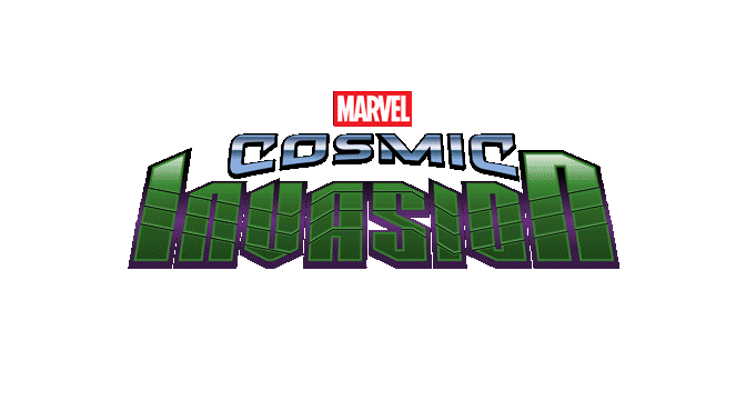
In 2025, I got to work on my first Marvel project: a beat ’em up with an incredible roster of heroes, staying close to the comics’ visual DNA, and an ambition that didn’t hide itself at all: Marvel Cosmic Invasion
Like on TMNT: Shredder’s Revenge, the very first piece of the project was the logo. That’s usually where I start. Before a single marketing visual exists, the logo is what has to carry the whole identity of the game.
The brief
The starting idea: a logo able to evoke several things at once. Space adventure, the comics universe, and the threat of the game’s main antagonist, Annihilus. The logo breaks down into three parts: the MARVEL block, which is the mark imposed by the studio, and the two words specific to the game, COSMIC and INVASION. I had several starting directions, but very quickly a texture language took over: something dynamic and futuristic for COSMIC, and something raw and organic for INVASION.
A handful of quick exploration passes got me surprisingly close to the final direction. What struck me at this stage was how fast the iterations converged toward exactly the feeling I was chasing.
Early iteration process
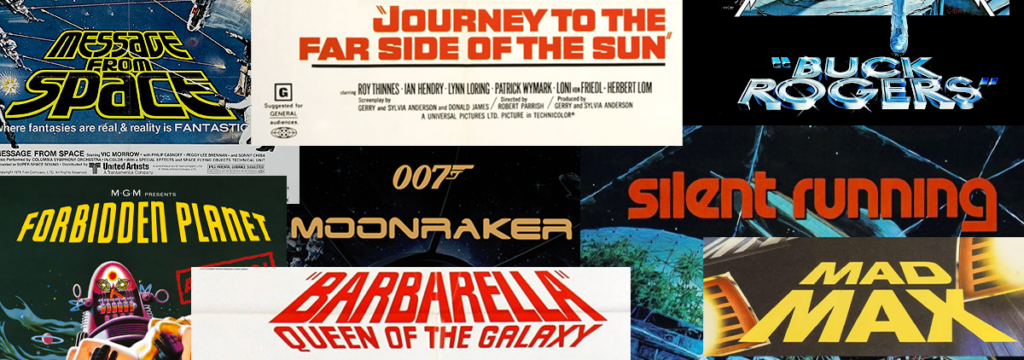
COSMIC: a nod to 60's and 70's sci-fi
So once I had my two base typefaces sketched out for COSMIC and INVASION, the real shaping work started.
COSMIC needed to stay simple. Bold shapes, slightly rounded corners, while keeping a futuristic, sci-fi feel close to movie titles from the ’60s and ’70s.
Reference board of period sci-fi title treatments (did you see those movies?)
A perspective effect on the letterforms reinforces that throwback feeling and does a lot of the work on its own. The choice of typeface matters just as much, and here’s a little crispy detail: it’s a font I designed entirely for this project. I’ll talk about this later…
the COSMIC wordmark
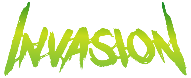
INVASION: organic, dirty, insectoid
INVASION needed something else. I wanted rough, organic letterforms, with connecting elements between the letters to create a sticky, slightly grimy feel. A direct nod to the villain’s insectoid origins. The result has a sort of « gooey » quality and that’s pretty fun.
the INVASION wordmark
close-up of the connective texture
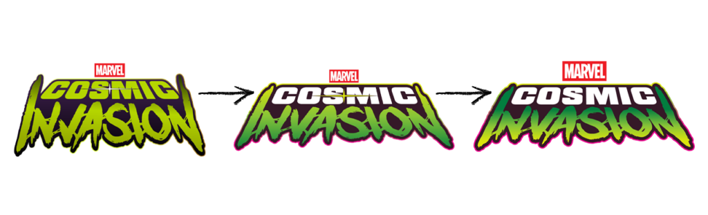
Finding the balance
From there it was just about adjusting the scale and perspective until every element harmonized with the others. A gradient outline running across the whole logo gives it a bit of glow and echoes the saturated colors of space-themed comic books.
An intermediate version also included a star, referencing Nova, but that turned out to be one element too many. I removed it to keep the logo readable at small sizes.
perspective and scale adjustments
Texture and production
The last step before finalizing was a surface texture: a classic comic book halftone print pattern, to push the « comic panel » feel a bit further. I built it first in Photoshop, then separated the texture from the letterforms so I could rebuild everything as vector art in Illustrator. That way the logo could scale cleanly across pretty much any format, from packaging down to a single icon.
apply the texture
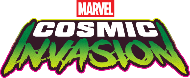
final logo! Tah-da!
So, that is how the logo for the game Marvel Cosmic Invasion was created!
Getting there wasn’t a straight line. There were several rounds of feedback with the rights holders, and quite a few directions that got dropped along the way. One I still smile about: an early pass where I worked a stylized Annihilus head into the « O » of INVASION (Looking back, not the best idea😄).
not a very good idea
What I like about the final result is that it works on almost every level. It nods to the comics, alludes to the villain, keeps a sci-fi reference, and still reads clearly in black and white and at small sizes.
Designing a custom typeface
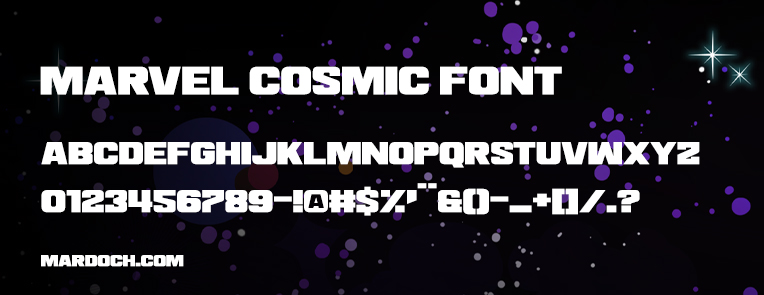
As mentioned above, I created a typeface entirely dedicated to the game and its logo. It’s a process that takes time, but it’s definitely worth it. It gives a marketing campaign a real visual asset of its own, instead of relying on a licensed or off-the-shelf font.
custom typeface specimen
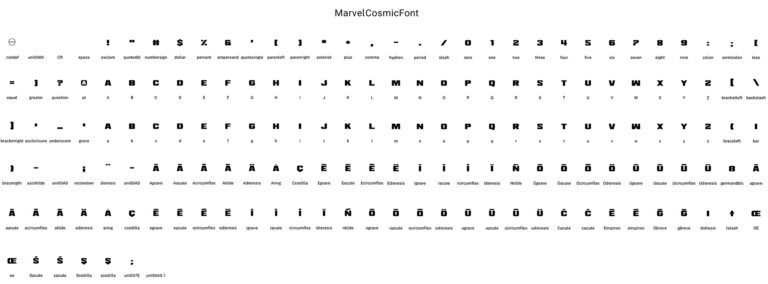
full character set specimen sheet
Animation from outer space
The last stage of the logo work was bringing it to life. Animating a logo is its own discipline. It has to read fast, feel original, and communicate a clear intention in two or three seconds.
My intention was to stay inside a sci-fi movie mood, so I animated COSMIC and INVASION as two separate beats.
For COSMIC, several references guided me, but the strongest was the opening titles of Flash Gordon (1980). I borrowed that trailing echo effect and applied it directly to the glyphs.
For INVASION, the reference is a genuine personal favorite: the title reveal from The Thing (1982). It’s an instantly recognizable move, and reusing it works both as a tribute to the film and as a way to anchor my logo firmly inside a well-defined genre. (I have slowed down the animation speed here so that its construction is easily visible👇).
Bringing both halves together makes the final animation much richer. I finished it with a light sheen sweeping across the outline, followed by a small starburst flare. One last callback to the original idea of tucking Nova‘s star somewhere into the logo.
Closing thoughts
Working on this logo was, once again, a genuine pleasure from start to finish. The collaboration with the Marvel team went smoothly, and that back and forth is a big part of why the final result holds up as well as it does.
I believe that logos shouldn’t merely complement a brand with a specific style; they need to tell a story and that’s especially true for video game logos. A good gaming logo embodies the game’s spirit by conveying a narrative, referencing specific themes, and projecting a distinct personality. It serves as a promise that the game’s true essence awaits the player.
Today, this logo gives the game a strong identity, instantly recognizable in a crowded market. I went on to create plenty of other assets for the game (trailers, key art, physical edition packaging, merchandise), but this logo remains a significant piece of the whole project. And a genuinely memorable milestone in my career!